New year, new market. Wanted to share a pair of charts of interest given this early year sell-off.
Staples vs the S&P. The ratio is bouncing at a familiar level (hence the coincidence reference). Investors flock to staples in risk off (versus the bond dogma we’ve been taught). This one’s a ratio to watch in the short term. Perhaps I’ll do a separate post, but the ETF’s largest components COST 0.00%↑ , WMT 0.00%↑ , PEP 0.00%↑ , KO 0.00%↑ , have some constructive charts.
Here’s another fun one. Coincidence that XLK 0.00%↑ (which is 45% MSFT 0.00%↑ and AAPL 0.00%↑ ) is backing off on relative basis to the S&P at the dotcom highs?
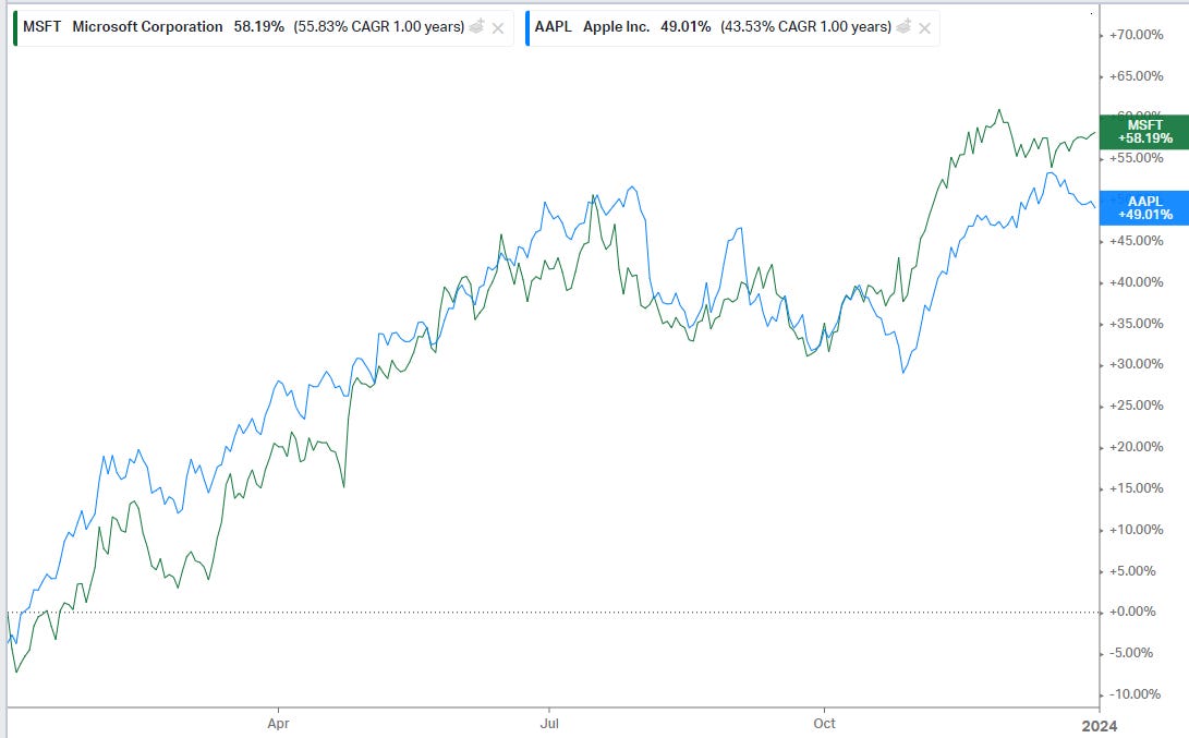
Think there isn’t profit taking in a pair of mega caps that were up 50% last year?
Portfolio insurance was still cheap less than a week ago. Those hedges are paying early on. They make early year rotations and profit taking more palatable for the long positions in a portfolio.


